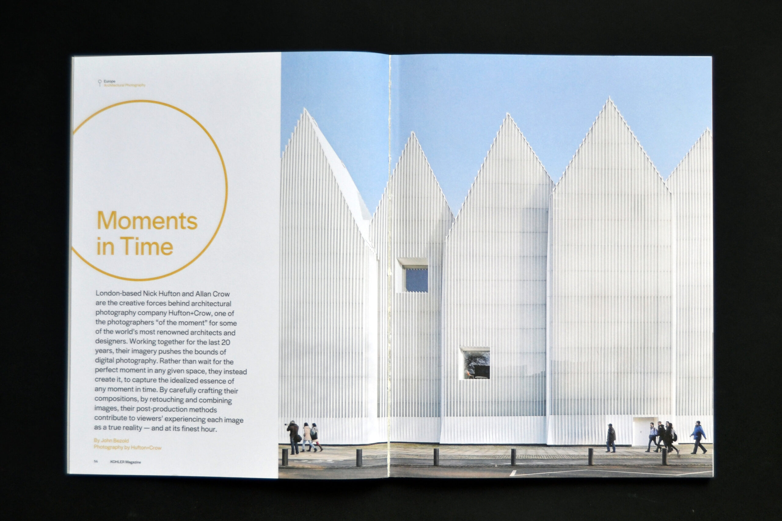
London-based Nick Hufton and Allan Crow are the creative forces behind architectural photography company Hufton+Crow, one of the photographers ‘of the moment’ for some of the world’s most renowned architects and designers. Working together for the last 20 years, their imagery pushes the bounds of digital photography. Rather than wait for the perfect moment in any given space, they instead create it, to capture the idealized essence of any moment in time. By carefully crafting their compositions, by retouching and combining images, their post-production methods contribute to viewers’ experiencing each image as a true reality–and at its finest hour.
You both have previously expressed that the image is the focus of your work and where it’s distributed is secondary, but does knowing you’ll reach a wider audience if your images are distributed digitally influence the manner in which you create them?
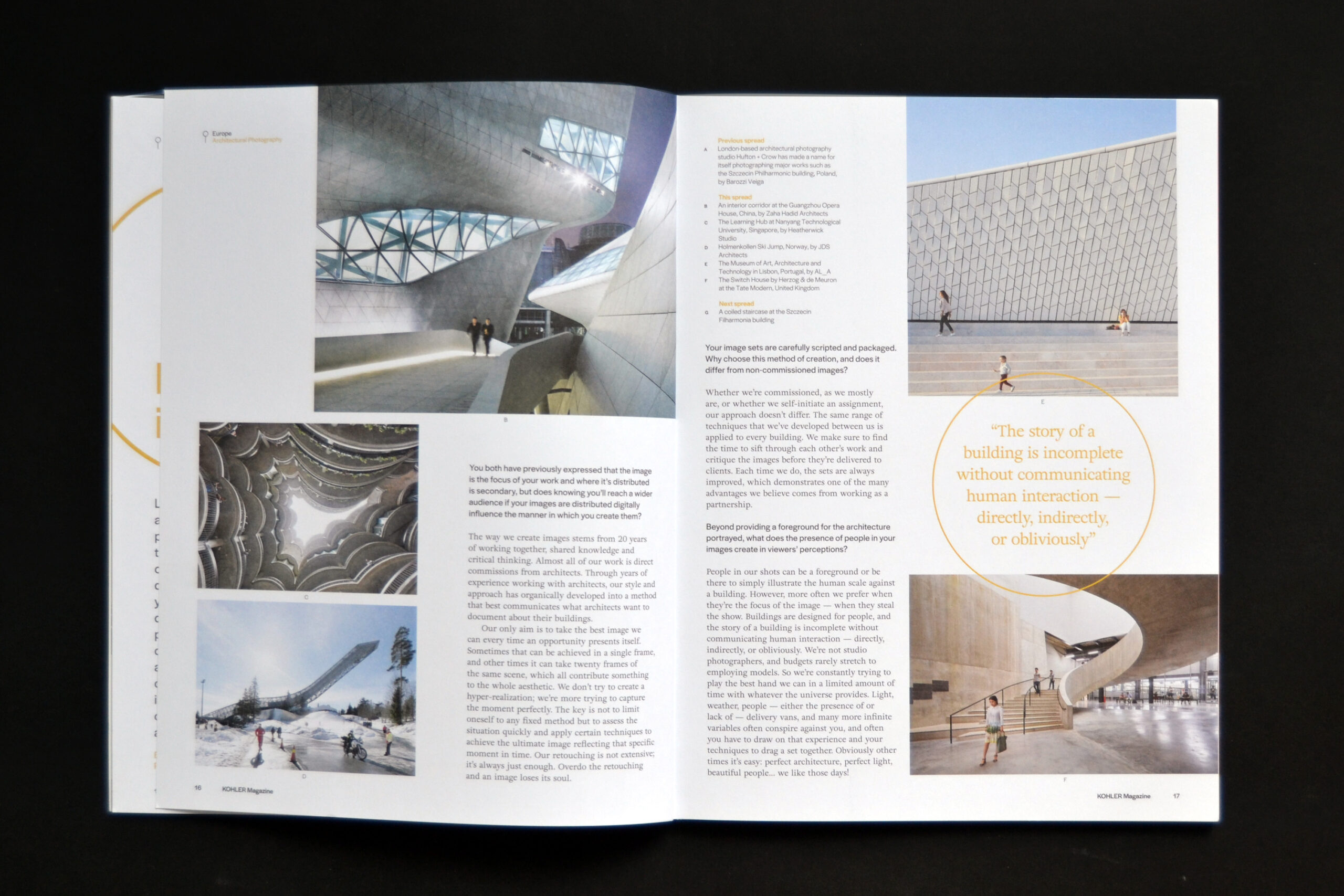
The way we create images stems from 20 years of working together, shared knowledge, and critical thinking. Almost all of our work is direct commissions from architects. Through years of experience working with architects, our style and approach has organically developed into a method that best communicates what architects want to document about their buildings. Our only aim is to take the best image we can every time an opportunity presents itself. Sometimes that can be achieved in a single frame, and other times it can take twenty frames of the same scene, which all contribute something to the whole aesthetic. We don’t try to create a hyper-realization; we’re more trying to capture the moment perfectly. The key is not to limit oneself to any fixed method but to assess the situation quickly and apply certain techniques to achieve the ultimate image reflecting that specific moment in time. Our retouching is not extensive; it’s always just enough. Overdo the retouching and an image loses its soul.
Your image sets are carefully scripted and packaged. Why choose this method of creation, and does it differ from non-commissioned images?
Whether we’re commissioned, as we mostly are, or whether we self-initiate an assignment, our approach doesn’t differ. The same range of techniques that we’ve developed between us is applied to every building. We make sure to find the time to sift through each other’s work and critique the images before they’re delivered to clients. Each time we do, the sets are always improved, which demonstrates one of the many advantages we believe comes from working as a partnership.
Beyond providing a foreground for the architecture portrayed, what does the presence of people in your images create in viewers’ perceptions?
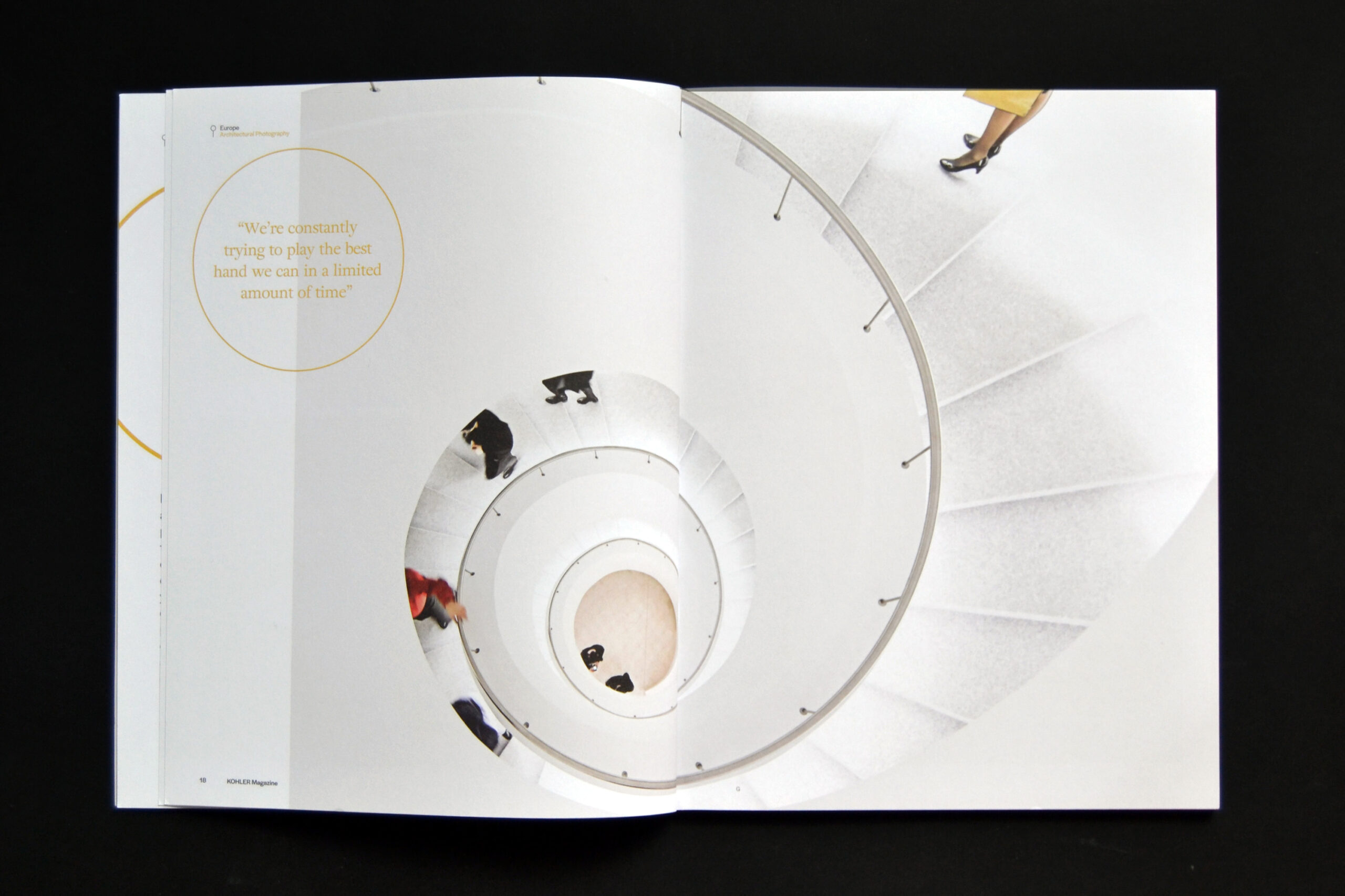
People in our shots can be a foreground or be there to simply illustrate the human scale against a building. However, more often we prefer when they’re the focus of the image–when they steal the show. Buildings are designed for people, and the story of a building is incomplete without communicating human interaction–directly, indirectly, or obliviously. We’re not studio photographers, and budgets rarely stretch to employing models. So we’re constantly trying to play the best hand we can in a limited amount of time with whatever the universe provides. Light, weather, people–either the presence of or lack of–delivery vans, and many more infinite variables often conspire against you, and often you have to draw on that experience and your techniques to drag a set together. Obviously other times it’s easy: perfect architecture, perfect light, beautiful people… we like those days!


